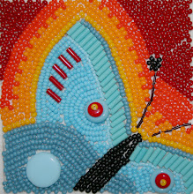
Here, and only a little late, is April's bead journal project. I'm enjoying the aspect of "journaling" through beads. I hadn't really thought much about representing my life, and the year, through beads. This month I think I've caught on to the concept, and the April piece, with its one blue dot against a background of orange, is about feeling alone in a lot of ways. My work situation changed drastically in the last year, and I'm still trying to figure out if the changes are good or bad.
Now that I'm 4 (almost 5 months) in, I don't know if I'd choose to do a colour wheel again. It gives me a chance to work in a lot of colours that I don't normally use, but there are colours I really don't like, such as orange, and having to put together a whole piece with that colour is sometimes tough.


9 comments:
These are so lovely!
I love this orange piece! So vibrant and the swirl bead paths are perfect for the color. Then those blue beads, a little off center, just set it off.
Wondering what you were thinking about...
I think your color wheel idea is a really good one! I'm a big fan of anything that people use to keep them on track. Lovely little orange piece :-)
I guess the discomfort with some of the colours is a challenge in itself, and worth congratulating yourself for persevering and completing it :) I'm enjoying your monthly beading series a lot. Hopefully the work issues will iron themselves out - I feel the same way with my job at the moment, and wondering when is the right time to say "enough is enough" ... hopefully the right road will present itself, whether it be continuing in the same role or looking elsewhere - you'll know when the time is right :)
It's tough feeling lonely, especially as alone as your April button shows. Yet you are surrounded by orange, which is a warm color, one that radiates energy and is said to stimulate activity and encourage socializing. Perhaps your piece is showing you a way out of lonliness and encouraging you to go for it???? I really love the way your four pieces look together! Even so, you don't have to stick with the color wheel thing... only if it feels right and serves you well... Robin A.
They are all so lovely hon. I really like the orange!!!
I give you a lot of credit for using a color you don't like. I think it's very hard to do, yet you did it so successfully. I like that the orange is a matte color. It is a very rich orange, almost like the color in canyons and rocks.
I really like the orange but I can definitely understand how some people wouldn't like working with it. I don't think there is such a thing as people who 'sorta' like orange. You either love it or you don't. lol
Well, there are certainly a lot of orange fans here, including me. I love the neatness and boldness of this piece. Good job!
Post a Comment